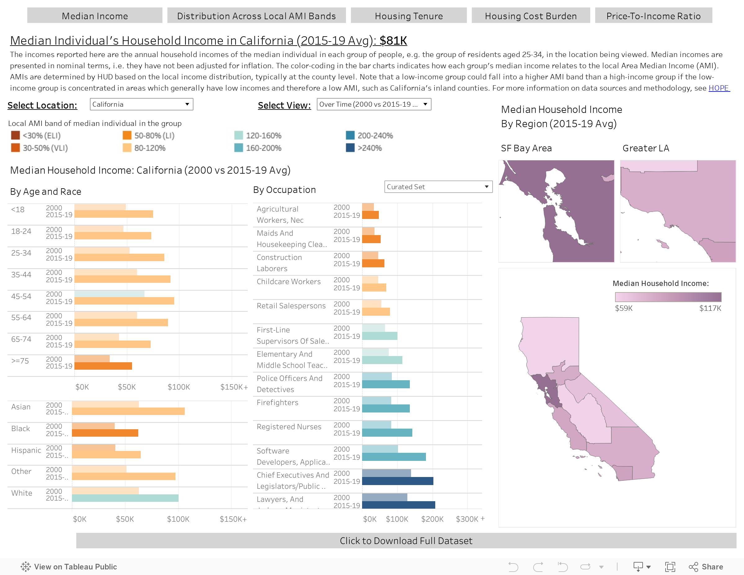
Income and Housing Affordability DASHBOARD
California faces a monumental problem: Five decades of economic strength coupled with increasingly restrictive land use policy have rendered much of the state unaffordable to most. More than ever before, the benefit to existing property owners now stands in visible contrast to the burden of more recent arrivals, including younger generations of Californians.
Although the challenge is daunting, California’s legislators are stepping up to address it with a flow of innovative legislative proposals, some of which have already become law.
Unfortunately, those legislators often have little or no access to data, and lack crucial information about their districts. To remedy the situation and better equip policy makers and their staff, we are introducing a new, user-friendly tool which provides detailed information on incomes and housing affordability in every state senate and assembly district. The data are visualized by age, race and occupation, and allow for easy comparison with the district’s past levels, as well as its standing versus the surrounding region and the state as a whole.
Along with our supporters at the Meta Housing Initiative, we are firm believers that a legislative process informed by data will lead to better legislation, and we hope that this new tool will help California’s policy makers grapple with housing affordability more effectively. The remainder of this article introduces some key insights that emerge from the data and doubles as a tutorial.
A New Tool At Your Disposal
The new tool consists of five tabs with a common structure:
The first two tabs, entitled “Household Income” and “Distribution Across Local AMI Bands”, address incomes.
The third tab, entitled “Housing Tenure”, provides information on rental and owner-occupancy shares, with homeowners further broken down into those with and without a mortgage.
The last two tabs, entitled “Housing Cost Burden” and “Price-To-Income Ratio”, illustrate the state of housing affordability.
Each tab contains a dropdown control that allows the user to select a location – a state assembly or senate district, one of eight broad regions, or the state as a whole. A separate dropdown controls the view, allowing the user to select a time period and comparison location of interest. Finally, the user can select from a number of occupation breakdowns, ranging from broad aggregate categories to a granular detailed classification.

Click and download image for full size view.
Example Insight #1: Racial Income Gaps
The Household Income tab reports household incomes for the median individual in different groups of interest. For example, setting “California” as the location and “2015-19 Avg” as the view (i.e. the average over the five-year period) shows that the median Black and Hispanic residents of the state have substantially lower household incomes than their White or Asian counterparts. Hovering over the bars in the chart (on the Dashboard; not in the figure below) reveals the specific income levels, as well as the number of people in each group. Because the racial income gap varies from place to place, the location can be set to view any of California’s state senate or assembly districts, as well as a set of eight regions corresponding to the state’s major metros and rural areas.

Area Median Income (AMI), determined annually by HUD, indicates the midpoint of an area’s household income distribution. Readers may be surprised to find that despite the household income of the median Asian in the state being slightly higher than that of their White counterpart, the median Asian falls in a lower AMI band (as indicated by the colors in Figure 1). How is that possible? Because AMI bands are determined locally, typically at the county level. Therefore, the income levels that define a band such as 80-120% AMI depend on the local income distribution which differs between counties. A certain household income, say $100k, often falls into a lower AMI band in coastal California counties with high-earning populations than in inland counties whose earning levels are lower. Because Asian households are more concentrated in high-income counties than White households, the median Asian’s household income falls in a lower AMI band than the White counterpart. (In addition, a household’s AMI band also depends on household size, which plays a role here too. For example a two-person household earning a household income of $100k would fall in a higher AMI band than a five-person household earning the same income)
Example Insight #2: Vulnerability of the Elderly
Another group of interest is the elderly, who are exceptionally vulnerable to increases in housing costs. Their earning years have passed, leaving them fewer options to raise their income, and they are generally less capable of moving elsewhere in search of more affordable housing. The income gap between residents over the age of 75 and their juniors aged 45 to 54 is even more stark than the income gap between Blacks and Whites (see Figure 2; and see Housing Tenure tab for information on the elderly’s renter and free and clear owner-occupancy shares).

Example Insight #3: Regional Differences
When the location is set to “California,” the map on the right hand side of the Median Household Income tab shows that incomes in the San Francisco Bay Area are substantially higher than elsewhere in the state, whereas the opposite is true in the state’s rural North. Switching the location setting from “California” (or one of its eight regions) to any state senate or assembly district will cause the map to shift from showing regions (Figure 3, left) to showing a corresponding view of senate or assembly districts (Figure 3, right), with insets focusing on smaller districts in the large coastal metros. Specific district numbers and their corresponding incomes are visible when hovering over the corresponding area of the map.

In addition to the map-based information, the view setting can be used to compare a state senate or assembly district to its region or to the state as a whole. The view setting can also be used to compare regions with the state, as shown by the comparative bar graphs in Figure 4. For example, setting the Bay Area region as the location (“ABAG”) and selecting the view that compares it with the state (“Vs. State (2015-19 Avg)”) shows that household incomes are higher in the Bay Area for virtually every race and age group, as well as every occupational group. In contrast, a similar comparison for the Greater Los Angeles region (“SCAG”) shows that in most cases household incomes are slightly lower in that region than they are statewide.

Example Insight #4: Have Housing Costs Grown Faster Than Incomes?
Another interesting set of comparisons is those over time. Setting the view to “Over Time (2000 vs 2015-19 Avg)” shows that every age group’s household income has grown over time. However, that income growth is nominal, meaning it hasn’t been adjusted for inflation, and a key question is how it compares to growth in households’ expenses, in particular for housing. If housing costs have grown faster than incomes, we should see a rise in the housing cost burden – the share of income spent on monthly housing costs, and the subject of the Housing Cost Burden tab.
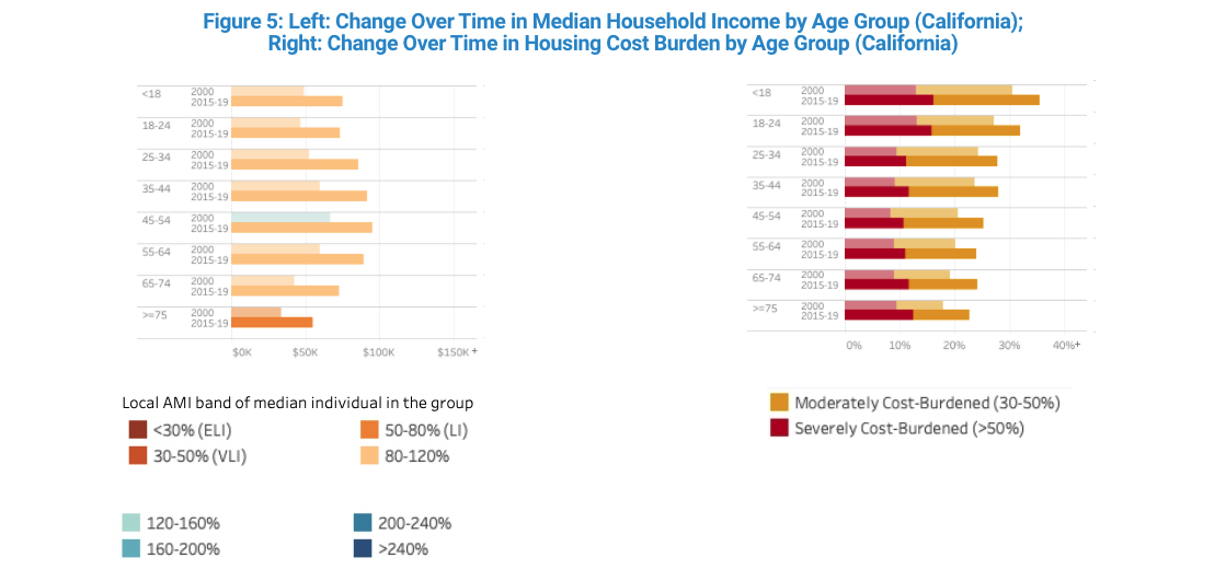
Looking at housing cost burdens over time reveals that, although household incomes increased over time, housing costs have increased even more. The share of residents whose households are moderately cost-burdened, i.e. who spend more than 30% of their income on housing, has risen for every age group, and so has the share that are severely cost-burdened, spending more than 50% of income on housing.
Example Insight #5: When Homeownership Depends Less on Income and More on Wealth
While the concept of housing cost burden relates income to the monthly cost of housing, such as rent or mortgage payment, the price-to-income ratio captures the full cost of buying a home, including the down payment which is paid as a one-time cost. The latter is particularly important given the high property values in the state, which mean that saving up for a down payment can delay the purchase of a home for many years, and which often limits the pool of potential buyers to those with sufficient inter-generational assistance. Put differently, when price-to-income ratios are very high, homeownership depends less on income and more on wealth.

The price-to-income ratio compares the price of a typical home in a residents’ local area with their actual household income, and the Price-To-Income Ratio tab reports that ratio for the household of the median individual in each group.[1] As a simple example, a household earning $100k per year in an area whose typical home costs $300k has a price-to-income ratio of 3. The map in Figure 6 shows that while it is very challenging to buy a home in Inland California, in Coastal California it is virtually impossible (for the median individual’s household). In general, first-time buyers will find it very challenging to buy a home that costs 4 to 5 times their annual income unless they are very wealthy (as opposed to high-earning), and the price-to-income ratio for the median household is well above that in all of Coastal California.
Example Insight #6: Which Occupations Struggle with Homeownership and Where?
A breakdown of the price-to-income ratio by occupations shows that California is “moderately unaffordable” even for CEOs. Indeed, the household of the median CEO in the Los Angeles region (“SCAG”) has a “seriously unaffordable” price-to-income ratio of 4.1, and their Bay Area (“ABAG”) counterpart has one of 4.6. In contrast, the San Joaquin Valley is affordable to CEOs (1.7) and is even affordable to elementary and middle-school teachers (2.7), but not to retail salespeople (4.1) or construction workers (4.6), and certainly not to agricultural workers (6.1).

Example Insight #7: Don’t Be Fooled By Population Sorting
Interpreting the data provided by the tool is not always straightforward, and one of the key challenges is population sorting. Beverly Hills offers a good illustration of the concept: While the enclave may register as affordable to its residents, that is only because its residents come from a small subset of people who are wealthy enough to afford to live in Beverly Hills. The phenomenon of population sorting, whereby the contours of the people living in a place are influenced by the nature of the place–and in particular its cost of housing–is not always as abundantly clear as it is in Beverly Hills, but it is nonetheless pervasive. It may be counterintuitive, but even though the cost of housing is generally higher in the Bay Area than in the Los Angeles region, housing cost burdens are generally lower in the Bay Area (Figure 7 illustrates this point by comparing cost burdens in both regions with those in the state). That is possible because income levels in the Bay Area are more than proportionally higher than those in the Los Angeles region compared to housing costs. The gradual process of population sorting – whereby those entering an area are on average more affluent than those leaving it – is an important part of the story and, crucially, population sorting is largely driven by differences in the cost of housing.[2],[3]

Example Insight #8: There is Increasingly Someone of Every Kind (Increasing Income Inequality Within Groups)
Another challenge to interpreting the data is that a group’s median individual offers only a limited view of the group in its entirety–the midpoint of a distribution that is broader. In reality, there are software developers in the Extremely Low Income AMI band (ELI; less than 30% AMI), and there are retail salespeople in the greater than 240% AMI band. The “Distribution Across Local AMI Bands” tab highlights the variation in household incomes within every group by providing their breakdown across local AMI bands. Hovering over the software developer bar, for example, reveals that while 4% of software developers statewide live in households below 30% AMI, 19% live in households above 240% AMI, and as much as 68% live in households above 120% AMI. In contrast, only 42% of retail salespeople statewide live in households above 120% AMI.

A comparison of the distribution across local AMI bands over time is consistent with an increase in income inequality. For example, statewide since 2000, every race and age group has seen the share of individuals in the 80-120% AMI band decrease substantially. And correspondingly, the share of individuals in the lowest AMI bands has increased for every race and age group, and for most groups the share in the highest AMI bands has increased as well.

Example Insight #9: Watching Homeownership Grow Further Out of Reach
Finally, the “Housing Tenure” tab provides information on whether residents rent their home, own it with a mortgage, or own it free and clear. The maps on this tab report the renter share, and highlight the fact that renters are more common in the more urban quarters of the Los Angeles and Bay Area regions: West LA in the former, and San Francisco and Oakland in the latter.

The charts, however, are more telling. Statewide since 2000, every race and age group has seen a decrease in the share of residents in households who own their homes with a mortgage. The shrinking share of the “Owner-Occupied with Mortgage” category has resulted from both an increase in the renter share and an increase in the share of those who own their homes free and clear. Although this is by no means the only explanation, growth in the share of those who own their homes free and clear, especially among younger age groups, may to some extent trace back to a growing likelihood of opting to live with one’s parents or to live in an inherited home.

Interestingly, the 65 to 74 and 75 and older age groups are the only ones whose share of residents owning free and clear has decreased, consistent with a prolonging of the climb up the homeownership ladder (i.e. people becoming first-time homeowners later in life and paying off their mortgage at later ages, on average). The rise of the renter share over time is also consistent with a prolonging of the climb up the homeownership ladder, as well as a reduced probability of transitioning from rental to homeownership.[4]
Data is Essential
The examples provided here only scratch the surface. We invite California’s legislators, their staff, and anyone else who is interested to spend time and dig deeper using the new tool. We also encourage interested users to go a step further and download and use the underlying data–known as the HOPE Tool–which provides far more information about California’s Housing, Occupations, People and Economics than is provided here. Both the information provided in the new tool here and the HOPE Tool on which it is built reflect our joint commitment with our supporters at Meta’s Housing Initiative to empower the state’s political discourse and legislative process with transparent data.
Notes:
1 This is an improvement over the Median Multiple, which is the ratio of the median home value to the median household income in an area, and which is widely used for evaluating affordability–see Wikipedia entry. The benchmark categories from “Affordable” to “Severely Unaffordable” are drawn from there, while the “Extremely Unaffordable” and “Essentially Beyond Reach” categories are our additions.
2 Population sorting is also driven by long-lasting differences in metro areas’ industrial mix. Whereas the Bay Area is home to an exceptional concentration of knowledge industries, the Los Angeles region’s economy skews more blue-collar.
3 An even finer level of nuance concerns the nature of population sorting by age. Because geographic mobility is far more common among young adults than among older age groups, population sorting patterns among older age groups may reflect a mixture of current and past economic conditions, such as those that prevailed at the time those age groups were at the age of peak-mobility.
4 The foreclosure crisis of the late 2000s is almost surely one of the reasons the ownership-with-mortgage category has shrunk, but it is not necessarily the most important one. First of all, while California’s homeownership was elevated on the eve of the foreclosure crisis in 2006 (60.2%), the state’s homeownership rates were not very far off in 2000 (57.1%) and in 2017 (54.4%), at the midpoint of the 2015-19 period (source: U.S. Census Bureau, Homeownership Rate for California [CAHOWN], retrieved from FRED, Federal Reserve Bank of St. Louis; https://fred.stlouisfed.org/series/CAHOWN, December 27, 2021). Second, and more importantly, the foreclosure crisis could not have raised the population share of those living in free and clear owner-occupied housing, as we see in the data. More explicitly, the foreclosure crisis could have raised the free-and-clear share of owner-occupant homeowners at the expense of those owing with a mortgage as foreclosed homeowners exited the homeowner pool, but inasmuch as the crisis converted those homeowners into renters it could not have increased the free and clear category’s share of the entire population.